HomeDocsComponentsBlocksChartsThemes
Introduction
  • Introduction
  • Installation
  • Themes
  • Artwork
  • llms.txt
Components
  • Accordion
  • Alert
  • Alert Dialog
  • Amount
  • Aspect Ratio
  • Audio Player
  • Avatar
  • Avatar Upload
  • Badge
  • Banner
  • Breadcrumb
  • Button
  • Button Group
  • Calendar
  • Card
  • Carousel
  • Chart
  • Checkbox
  • Code Block
  • Collapsible
  • Color Picker
  • Combobox
  • Command
  • Context Menu
  • Copy Button
  • Countdown
  • Data Grid
  • Data Table
  • Date Picker
  • Date Range Picker
  • Description List
  • Device Mockup
  • Dialog
  • Direction
  • Dot Loader
  • Drawer
  • Dropdown Menu
  • Empty
  • Field
  • File Upload
  • Hover Card
  • Input
  • Input Group
  • Input OTP
  • Item
  • Kanban
  • Kbd
  • Label
  • Menubar
  • Meter
  • Multi Select
  • Native Select
  • Navigation Menu
  • Number Field
  • Pagination
  • Password Strength
  • Phone Input
  • Popover
  • Progress
  • Progress Circle
  • Radio Group
  • Rating
  • Resizable
  • Responsive Dialog
  • Rich Text Editor
  • Scroll Area
  • Segmented Control
  • Select
  • Separator
  • Sheet
  • Sidebar
  • Signature
  • Skeleton
  • Slider
  • Sortable
  • Spinner
  • Stat
  • Stepper
  • Switch
  • Table
  • Tabs
  • Tag Input
  • Terminal
  • Textarea
  • Time Field
  • Timeline
  • Toast
  • Toggle
  • Toggle Group
  • Tooltip
  • Tree
  • Typography
  • Video Player
  • Window Mockup
AI
  • Message Scroller
  • Message
  • Bubble
  • Marker
  • Attachment
  • Questionnaire
  • Composer
  • Reasoning
  • Tool Call
  • Approval Card
  • Citations
Blocks
  • Airtable
  • Airtable Kanban
  • ClickUp List
  • ClickUp Kanban
  • Repeatable Group
  • Command Palette
  • Sign In and Sign Up
  • Availability Scheduler
  • AI Chat
  • Action Bar
  • Notion
  • Banking
  • Lineup Builder
  • Sports Score
  • Strava
  • Sheets
  • Notices
  • Settings
  • Billing
Templates
  • Sign In Page
Utilities
  • motion
  • sounds
  • scroll-fade
  • shimmer
Another UI. Built on shadcn/ui with Phosphor icons.

Sign In Page

PreviousNext

A full page sign in, sign up, forgot password and confirm email template, with a live product preview over public domain paintings.

Demo: password password1!, code 123456

Full page
Invoicely

Sign in to Invoicely

Welcome back. Enter your details to continue.

or

Don't have an account?

Every customer, one search away.

All customers
No customers found.
Recently viewed
AAmmar Foleyammar@foley.studio
LLily-Rose Chedjouhi@lilyrose.co
SSienna Hewittsienna@hewitt.design
All customers
MMathilde Lewishello@mathildelewis.co
FFleur Cookfleur@fleurcook.xyz
LLulu Meyerslulu@lulumeyers.com
navigateopenescclose
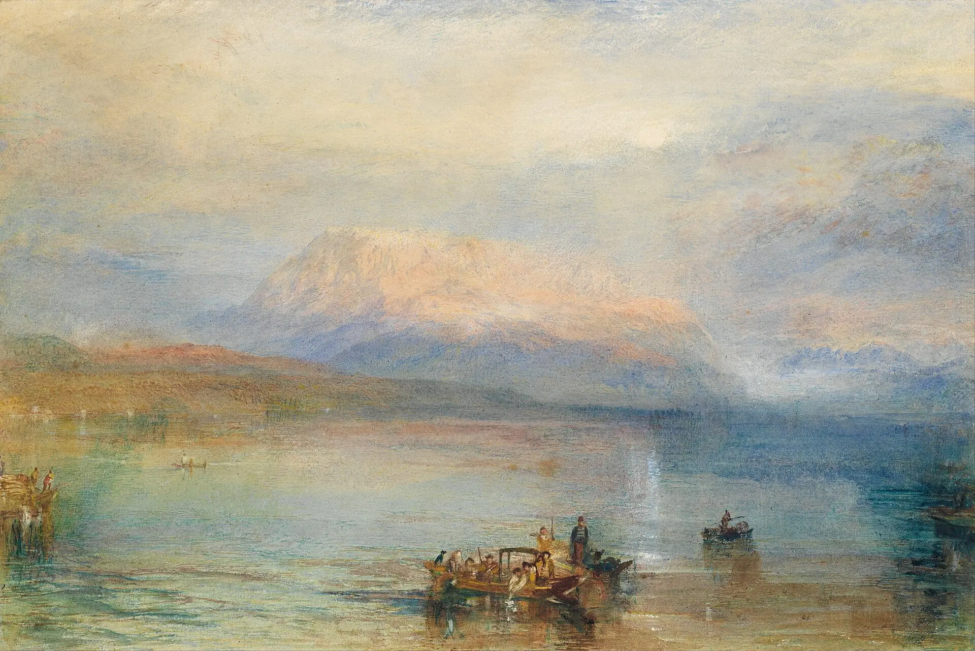
The Red Rigi, J. M. W. Turner, 1842

Installation#

pnpm dlx shadcn@latest add https://anotherui.dev/r/auth-page.json

Then render it on its own route:

app/sign-in/page.tsx
import { AuthPage } from "@/components/blocks/auth-page"
 
export default function SignInPage() {
  return <AuthPage product="Invoicely" />
}

Features#

  • Two columns. The form sits in a quiet column with the logo above it and the terms pinned to the bottom. On wide screens a rounded art panel fills the right. On phones the panel drops away.
  • A painting per view. Sign in, sign up, forgot password and the code step each have their own painting, and they cross fade as you move between them. Nine colour groups to pick from.
  • A live preview. The panel shows a customer search built from Command, Avatar and Kbd. It works, so you can type in it. Swap it for a screenshot or anything else with preview.
  • Every step. It wraps the Sign In and Sign Up block, so validation, the password checklist, the six digit code and the provider buttons all come with it.
  • Credited art. The painting's title, artist and year sit in the corner and link to the source.

The artwork#

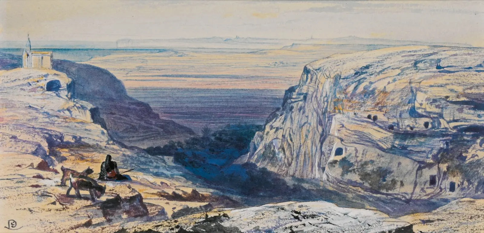
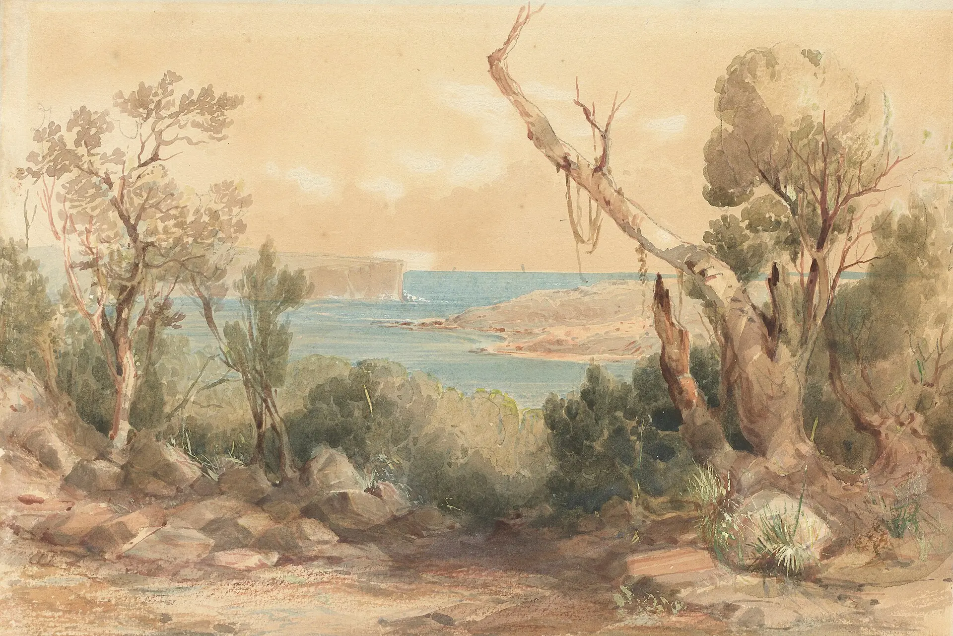
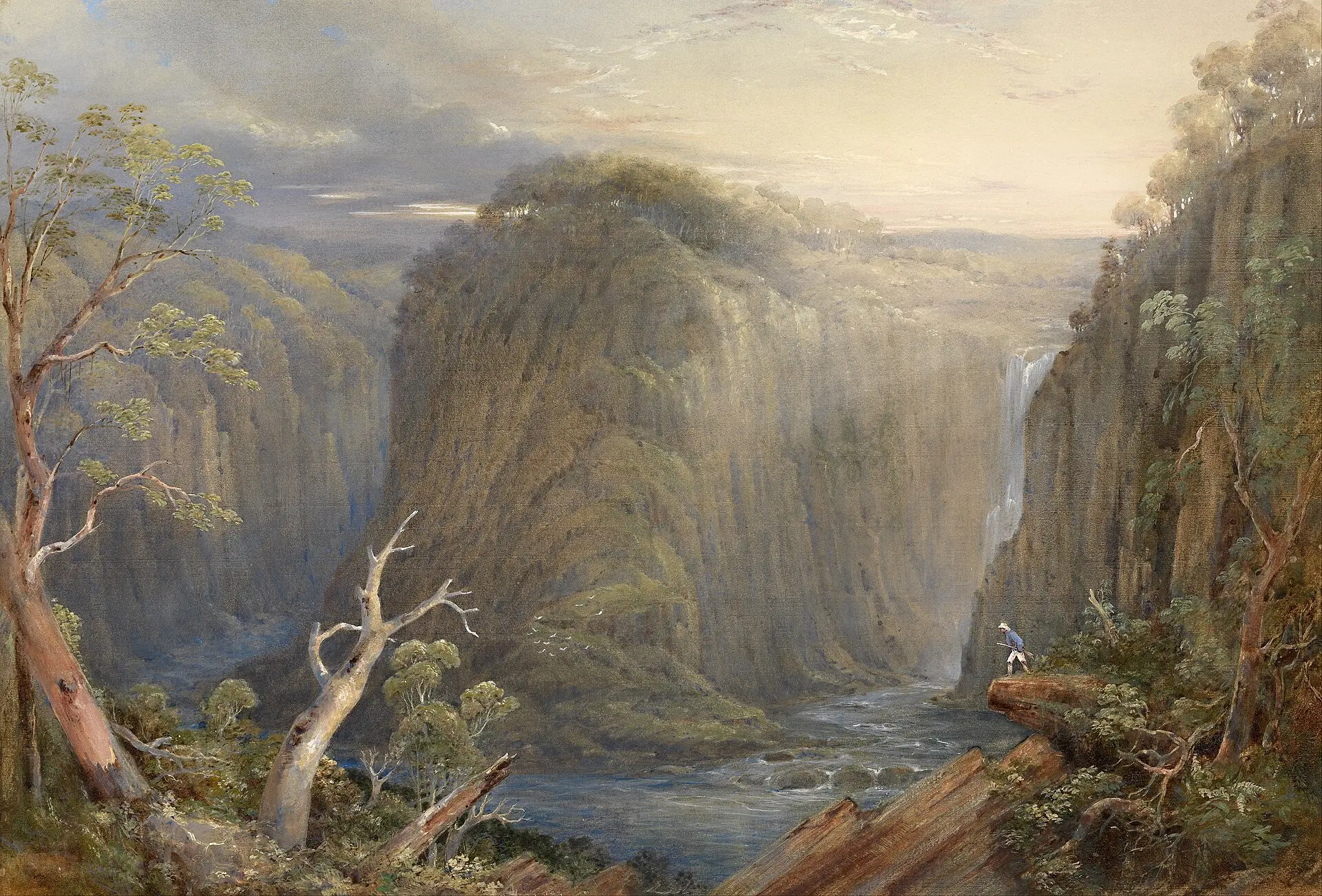
By default the four views use public domain watercolours by Turner, Conrad Martens and Edward Lear. Pass palette to use one of the colour groups from the Artwork page instead: warm, autumn, pastel, green, blue, night, snow, earth or storm. The installed template loads the images from anotherui.dev. Copy them into public/art/ to host them yourself.
Usage#

<AuthPage
  product="Invoicely"
  headline="Every invoice, one place."
  palette="blue"
  preview={<img src="/screenshot.png" alt="" className="rounded-xl shadow-2xl" />}
  art={{ "sign-in": { src: "/my-art.webp", title: "Morning", artist: "You", year: "2026" } }}
  onSignIn={async ({ email, password }) => (await signIn(email, password)).ok}
  onVerify={async (email, code) => (await checkCode(email, code)).ok}
  onAuthenticated={() => router.push("/dashboard")}
/>

Props#

  • product, logo. The name and mark at the top of the form column.
  • headline. The line over the art panel.
  • preview. What floats over the art. A customer search by default.
  • palette. A colour group from the Artwork page. Its paintings are spread across the views.
  • art. A painting per view: src, title, artist, year, and optional href and position. Views you leave out keep the default.
  • terms. The line at the bottom of the form column. Pass null to hide it.
  • Every other prop goes to the Sign In and Sign Up block: defaultView, providers, collectName and the handlers.
Billingmotion

On This Page

InstallationFeaturesThe artworkUsageProps