HomeDocsComponentsBlocksChartsThemes
Introduction
  • Introduction
  • Installation
  • Themes
  • Artwork
  • llms.txt
Components
  • Accordion
  • Alert
  • Alert Dialog
  • Amount
  • Aspect Ratio
  • Audio Player
  • Avatar
  • Avatar Upload
  • Badge
  • Banner
  • Breadcrumb
  • Button
  • Button Group
  • Calendar
  • Card
  • Carousel
  • Chart
  • Checkbox
  • Code Block
  • Collapsible
  • Color Picker
  • Combobox
  • Command
  • Context Menu
  • Copy Button
  • Countdown
  • Data Grid
  • Data Table
  • Date Picker
  • Date Range Picker
  • Description List
  • Device Mockup
  • Dialog
  • Direction
  • Dot Loader
  • Drawer
  • Dropdown Menu
  • Empty
  • Field
  • File Upload
  • Hover Card
  • Icon Tile
  • Input
  • Input Group
  • Input OTP
  • Item
  • Kanban
  • Kbd
  • Label
  • Menubar
  • Meter
  • Multi Select
  • Native Select
  • Navigation Menu
  • Number Field
  • Pagination
  • Password Strength
  • Phone Input
  • Popover
  • Progress
  • Progress Circle
  • Radio Group
  • Rating
  • Resizable
  • Responsive Dialog
  • Rich Text Editor
  • Scroll Area
  • Segmented Control
  • Select
  • Separator
  • Sheet
  • Sidebar
  • Signature
  • Skeleton
  • Slider
  • Sortable
  • Spinner
  • Stat
  • Stepper
  • Switch
  • Table
  • Tabs
  • Tag Input
  • Terminal
  • Textarea
  • Time Field
  • Timeline
  • Toast
  • Toggle
  • Toggle Group
  • Tooltip
  • Tree
  • Typography
  • Video Player
  • Window Mockup
AI
  • Message Scroller
  • Message
  • Bubble
  • Marker
  • Attachment
  • Questionnaire
  • Composer
  • Reasoning
  • Tool Call
  • Approval Card
  • Citations
Blocks
  • Airtable
  • Airtable Kanban
  • ClickUp List
  • ClickUp Kanban
  • Repeatable Group
  • Command Palette
  • Sign In and Sign Up
  • Availability Scheduler
  • AI Chat
  • Action Bar
  • Notion
  • Banking
  • Lineup Builder
  • Sports Score
  • Strava
  • Sheets
  • Notices
  • Settings
  • Billing
Templates
  • Sign In Page
  • Upload Page
  • Agreement Sign
Utilities
  • motion
  • sounds
  • scroll-fade
  • shimmer
Another UI. Built on shadcn/ui with Phosphor icons.

Agreement Sign

PreviousNext

A full page step to read and sign an agreement, with the steps of the flow on a glass card over a public domain painting.

Fill in the form and sign to reach the welcome step.

Full page
Invoicely

Sign agreement

Review our to complete setup.

Draw your signature with a mouse, pen or finger. Keyboard users can switch to Type mode.

Sign here

By signing this agreement, you agree that this electronic signature is legally binding and has the same effect as a handwritten signature.

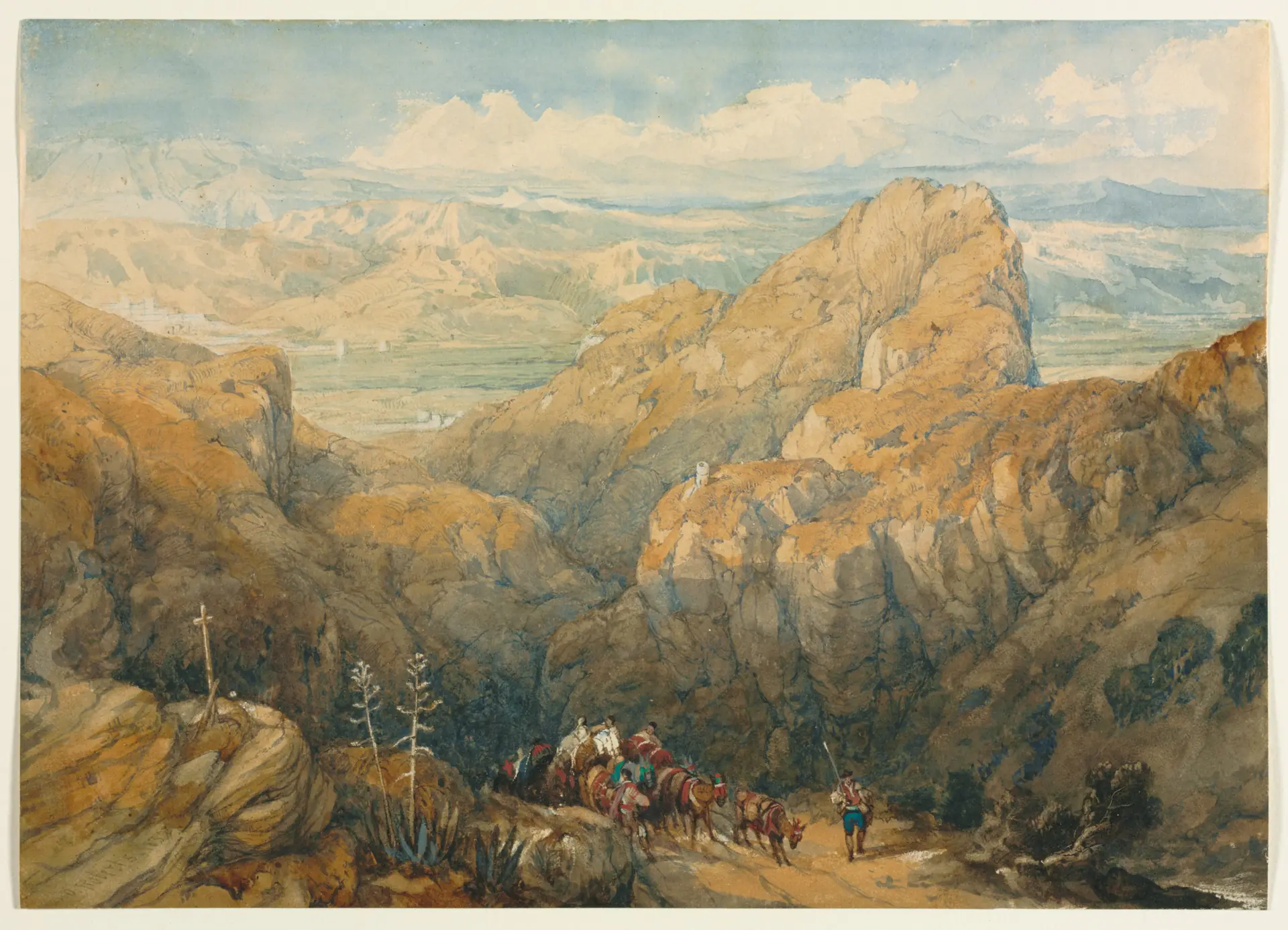
Descent into the Plain of Granada, David Roberts, 1834

Installation#

pnpm dlx shadcn@latest add https://anotherui.dev/r/agreement-page.json

Then render it on its own route:

app/onboarding/agreement/page.tsx
import { AgreementPage } from "@/components/blocks/agreement-page"
 
export default function AgreementRoute() {
  return <AgreementPage product="Invoicely" />
}

Features#

  • Same layout as the other templates. It shares Template Layout with the Sign In Page and Upload Page.
  • Steps on the painting. The flow sits on the art panel as a glass Stepper inside a glass Card. Each step has its own painting, and finished steps tick off as you go. On phones, where the painting is hidden, a horizontal Stepper sits above the form.
  • Draw or type. The Signature pad takes a drawn signature or a typed one in a script font, and uses the name you entered as its placeholder.
  • Read before signing. The agreement link opens a Dialog with the full text in a scroll area.
  • Checked before it moves on. Name, email and signature are all required. Missing ones turn red, show a message and shake.
  • A welcome step. After signing, the stepper moves on, the painting changes and the page shows the signature with a Get started button.

The artwork#

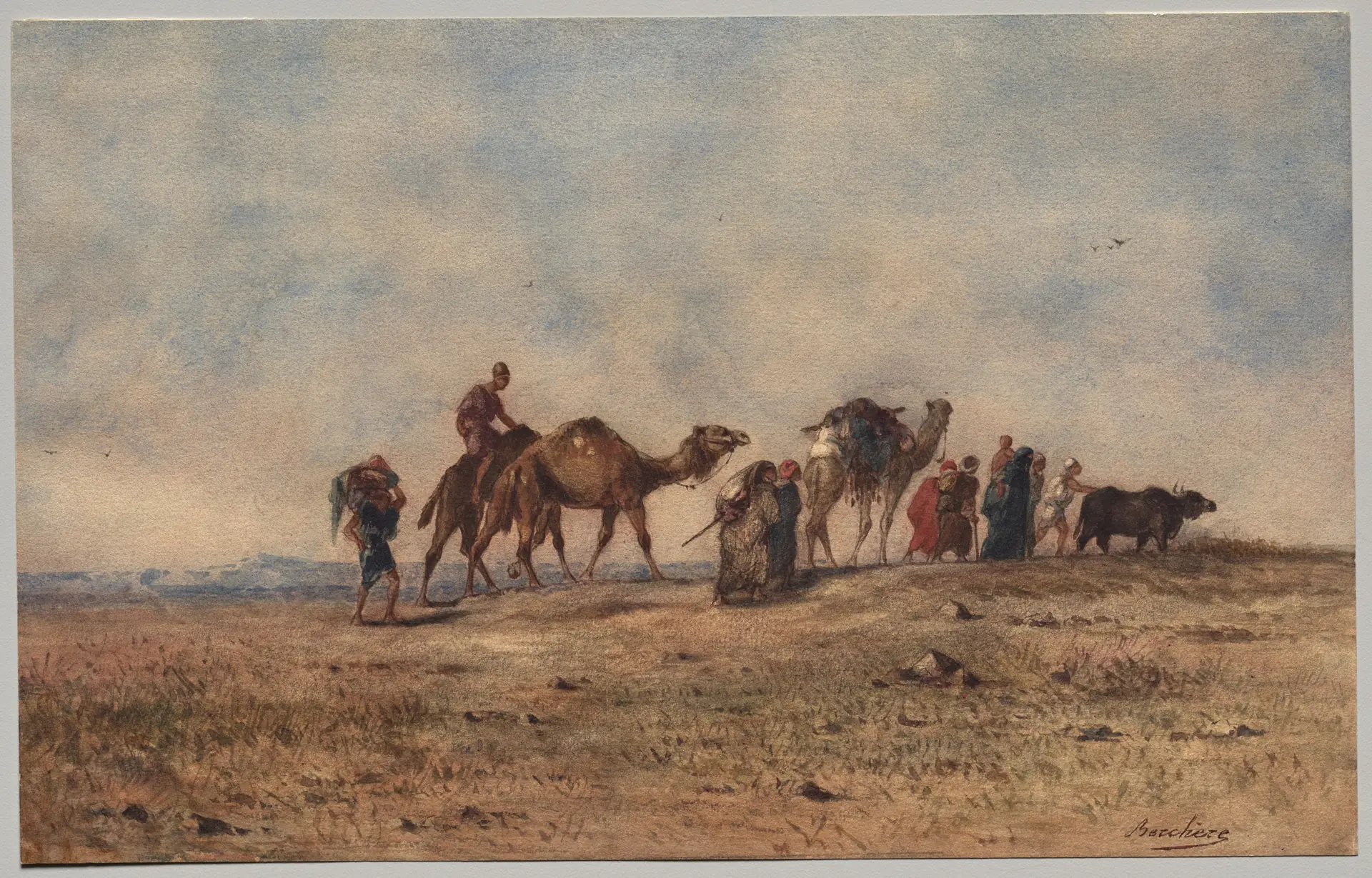
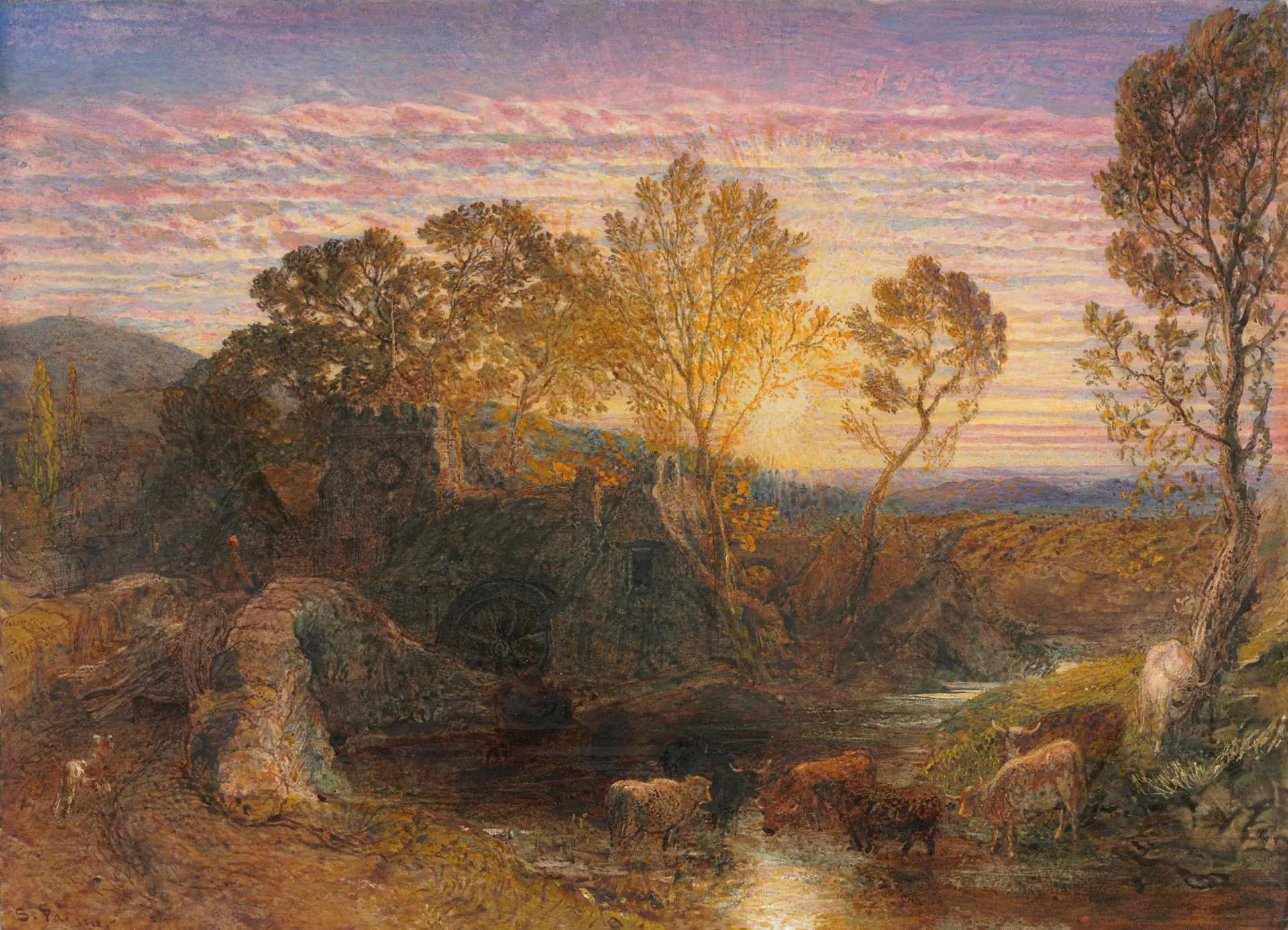
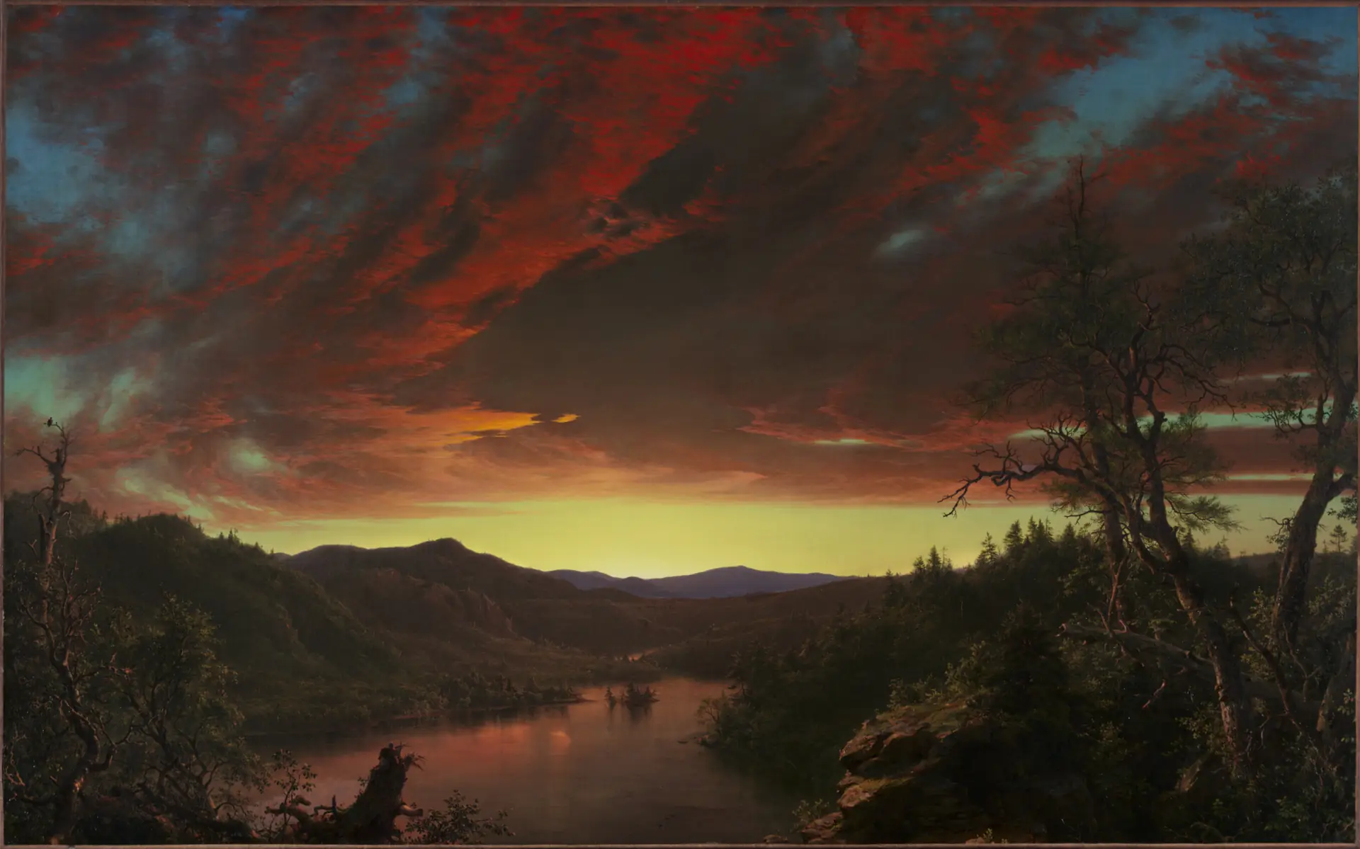
The default steps use four paintings from the Artwork page: Narcisse Berchère's A Caravan in the Desert, Samuel Palmer's The Golden Hour, David Roberts's Descent into the Plain of Granada and Frederic Edwin Church's Twilight in the Wilderness. Each step carries its own art, so you can use any painting with artworkById.

Usage#

import { artworkById } from "@/components/blocks/artwork"
import { AgreementPage } from "@/components/blocks/agreement-page"
 
<AgreementPage
  product="Invoicely"
  agreementName="service agreement"
  agreement={<ServiceAgreement />}
  onSign={async ({ name, email, signature }) => {
    await saveSignature({ name, email, png: signature.dataUrl })
  }}
  onFinish={() => router.push("/dashboard")}
  steps={[
    { title: "Your details", art: artworkById("corn-fields") },
    { title: "Verify your email", art: artworkById("lake-pepin") },
    { title: "Sign agreement", art: artworkById("umbrian-valley") },
    { title: "Welcome", art: artworkById("malaga-harbor") },
  ]}
/>

Props#

  • product, logo. The name and mark at the top of the content column.
  • steps. The flow: title, optional description, and art.
  • signStep. Which step is the signing step, from 1. The step after it is the welcome. 3 by default.
  • agreementName. The link text in "Review our … to complete setup."
  • agreement. The agreement shown in the dialog.
  • onSign. Runs with the name, email and signature once the form is valid. A spinner shows while it runs.
  • onFinish. The Get started button on the welcome step.
  • footer. A line pinned to the bottom of the content column.
Upload Pagemotion

On This Page

InstallationFeaturesThe artworkUsageProps