HomeDocsComponentsBlocksChartsThemes
Introduction
  • Introduction
  • Installation
  • Themes
  • Artwork
  • llms.txt
Components
  • Accordion
  • Alert
  • Alert Dialog
  • Amount
  • Aspect Ratio
  • Audio Player
  • Avatar
  • Avatar Upload
  • Badge
  • Banner
  • Breadcrumb
  • Button
  • Button Group
  • Calendar
  • Card
  • Carousel
  • Chart
  • Checkbox
  • Code Block
  • Collapsible
  • Color Picker
  • Combobox
  • Command
  • Context Menu
  • Copy Button
  • Countdown
  • Data Grid
  • Data Table
  • Date Picker
  • Date Range Picker
  • Description List
  • Device Mockup
  • Dialog
  • Direction
  • Dot Loader
  • Drawer
  • Dropdown Menu
  • Empty
  • Field
  • File Upload
  • Hover Card
  • Icon Tile
  • Input
  • Input Group
  • Input OTP
  • Item
  • Kanban
  • Kbd
  • Label
  • Menubar
  • Meter
  • Multi Select
  • Native Select
  • Navigation Menu
  • Number Field
  • Pagination
  • Password Strength
  • Phone Input
  • Popover
  • Progress
  • Progress Circle
  • Radio Group
  • Rating
  • Resizable
  • Responsive Dialog
  • Rich Text Editor
  • Scroll Area
  • Segmented Control
  • Select
  • Separator
  • Sheet
  • Sidebar
  • Signature
  • Skeleton
  • Slider
  • Sortable
  • Spinner
  • Stat
  • Stepper
  • Switch
  • Table
  • Tabs
  • Tag Input
  • Terminal
  • Textarea
  • Time Field
  • Timeline
  • Toast
  • Toggle
  • Toggle Group
  • Tooltip
  • Tree
  • Typography
  • Video Player
  • Window Mockup
AI
  • Message Scroller
  • Message
  • Bubble
  • Marker
  • Attachment
  • Questionnaire
  • Composer
  • Reasoning
  • Tool Call
  • Approval Card
  • Citations
Blocks
  • Airtable
  • Airtable Kanban
  • ClickUp List
  • ClickUp Kanban
  • Repeatable Group
  • Command Palette
  • Sign In and Sign Up
  • Availability Scheduler
  • AI Chat
  • Action Bar
  • Notion
  • Banking
  • Lineup Builder
  • Sports Score
  • Strava
  • Sheets
  • Notices
  • Settings
  • Billing
Templates
  • Sign In Page
  • Upload Page
  • Agreement Sign
Utilities
  • motion
  • sounds
  • scroll-fade
  • shimmer
Another UI. Built on shadcn/ui with Phosphor icons.

Upload Page

PreviousNext

A full page first upload step with a drop zone, progress rows and quotes over public domain paintings, in the same layout as the Sign In Page.

Uploads are simulated. Use the arrows on the quote to change the painting.

Full page

Installation#

pnpm dlx shadcn@latest add https://anotherui.dev/r/upload-page.json

Then render it on its own route:

app/welcome/page.tsx
import { UploadPage } from "@/components/blocks/upload-page"
 
export default function WelcomePage() {
  return <UploadPage product="Invoicely" />
}

Features#

  • Same layout as sign in. It shares Template Layout with the Sign In Page: the logo up top, the content in a quiet column and a rounded art panel on the right that drops away on phones.
  • A real drop zone. It is the File Upload component. Drop, browse or paste files, watch each one's progress, retry a failed one or remove it.
  • Continue when ready. Continue stays off until at least one file has finished, and says "Uploading" while any are still going. Skip for now sits under it.
  • Quotes that change the painting. A glass Card at the bottom of the panel steps through testimonials with glass Buttons, and each quote cross fades to its own painting.

The artwork#

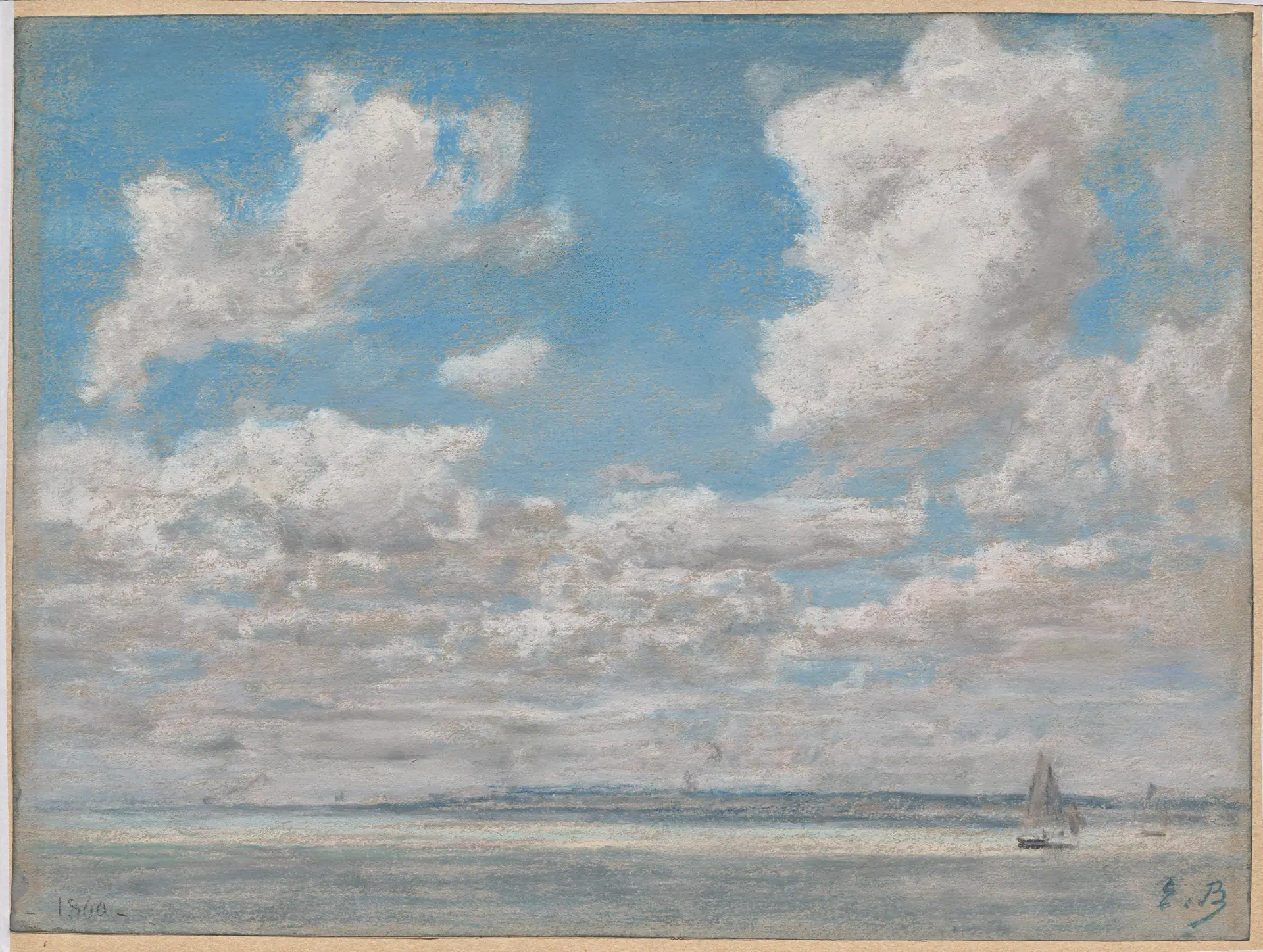
The default quotes use four paintings from the Artwork page: Eugène Boudin's Seascape with Open Sky, Frederick Gottwald's The Umbrian Valley, Lawrence Blazey's Malaga Harbor and Robert S. Duncanson's View of Lake Pepin. Each quote carries its own art, so you can use any painting from the collection with artworkById.
Usage#

import { artworkById } from "@/components/blocks/artwork"
import { UploadPage } from "@/components/blocks/upload-page"
 
<UploadPage
  product="Invoicely"
  title="Add your first invoices"
  accept=".pdf,image/*"
  onUpload={(file, { onProgress, signal }) => uploadFile(file, onProgress, signal)}
  onContinue={(files) => router.push("/dashboard")}
  onSkip={() => router.push("/dashboard")}
  testimonials={[
    {
      quote: "Month end used to take a week.",
      name: "Sam Lee",
      role: "Bookkeeper",
      art: artworkById("twilight-in-the-wilderness"),
    },
  ]}
/>

Props#

  • product, logo. The name and mark at the top of the content column.
  • title, description. The heading over the drop zone.
  • accept, maxSize. Passed to the drop zone.
  • dropTitle, dropDescription. The words inside the drop zone.
  • onUpload. Sends one file. Call onProgress with 0 to 100 and stop when the signal aborts. Without it, files finish at once.
  • onContinue. Runs with the finished files. A spinner shows while it runs.
  • onSkip. Shows the Skip for now button.
  • testimonials. The quotes: quote, name, role and art.
  • footer. A line pinned to the bottom of the content column.
Sign In PageAgreement Sign

On This Page

InstallationFeaturesThe artworkUsageProps